
Rex
An App For Saving and Remembering Recommendations

Overview
Many people struggle to use an effective method for storing and remembering recommendations for books, movies, restaurants, products, and more. People typically receive recommendations while talking to others and want to quickly take note of the recommendation. They use the quickest method in the moment, which can later result in unclear or poorly categorized notes or forgotten recommendations. The problem is:
Busy people need an intuitive and more organized way of keeping and organizing recommendation and a way of remembering to check them out later.I kept these goals in mind while I designed and built a solution to solve this problem:
Adds a recommendation quickly and simply
Easily and intuitively organizes recommendations
Helps users remember to check out recommendations later
My solution is a responsive cross-platform application and website that stores, organizes, and reminds people of those recommendations.
Role: Sole UX/UI Designer
Duration: 1 month (Sep-Oct 2023)
Tools: Figma, FigJam, Canva
Design Process
1 - Research
2 - Strategy
3 - Design
4 - Refine
5 - Conclude & Reflect
Step 1: Research
I started with an initial survey to identify a problem that a majority of other people face. Using the respondents from my survey, I did user interviews to more deeply understand the problem. I complemented the user interviews with a competitive analysis to understand how people are currently using tools to address the problem.
I wanted to create an app that solves an everyday problem, so I brainstormed a variety of different challenges that I personally face. I created a survey to see if other people face those challenges too. I sent the survey to friends and family with a wide range of ages, occupations, and lifestyles and received twenty responses. Since I asked about many different types of problems, I hoped to find a majority of people who are challenged by at least one problem, so that I could design a solution for that problem. The common problem I found was that many socially active adults struggle with effectively taking note of the recommendations they receive.
Initial Research

Is this something you experience?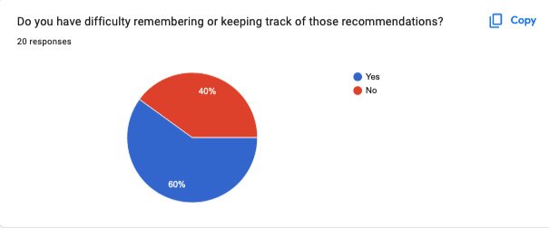
Is this a problem for you?What’s your current approach?
Why is it a problem for you?
By establishing that many people, not only myself, encounter this problem of organizing and remembering recommendations, I was able to begin further researching the problem.
Competitive Analysis
During the initial survey, I asked users what tools they currently use to note their recommendations. I researched those tools as well as other apps that were popular in the App Store for organizing thoughts and ideas. I performed a SWOT analysis to assess the apps.

Competitive Analysis Insights
No simple tool exists to solve the challenges found from the user interviews
Important that the app can sync across devices
Useful when the app has a self-organizing system rather than relying on the user to create an organization system
Key that an app is easy to learn to use
User Interviews
I conducted user interviews with 5 participants from the initial survey who face this recommendation problem. I chose people who were representative of the range of respondents–people with different ages, professions, and living in different countries.
These were my goals for the user interviews:
Understand the information that is important to remember when writing down a recommendation
Determine when and from whom people receive recommendations
Discover the strengths and weaknesses of their current strategy for remembering recommendations
Learn what would improve their process for remembering recommendations
User Interview Insights
The main issues with users’ current strategy is they don’t remember writing down recommendations and that they don’t have a central location for collecting recommendations
Users receive recommendations personally and professionally and almost always in-person
Users want to remember who a recommendation is from and details about the recommendation that will give it context
Users want a tool that reminds them to check out the recommendations
After conducting all of the user interviews, I put the data onto sticky notes in FigJam in order to affinity map. This helped me to see the common themes among users. Then, I organized the themes into subcategories in order to better understand the wants, needs, and experience of users.
Affinity mapping
Group mapping
User comments
Step 2: Strategy
First, I established who my users are by using my research to create personas. Then, I refined my original goals based on my learnings so far. After that, I began ideating through sketching. I designed a user flow, created a mood board, and developed a style guide.
User Personas
Using my insights from the user interviews and competitive analysis, I created two user personas. People who would benefit from Rex have busy lives where they regularly receive recommendations, and need a way to quickly write them down in an organized way so that they can return to the conversation. They don’t currently have an organized system that helps them effectively remember and check the recommendations that they’ve been given.

Persona 1: Young to Mid-AdultOften has a method for noting recommendations, but doesn’t look at them
Comfortable with technology
Juggling lots of responsibilities
Needs an intuitive & easy-to-use tool

Persona 2: Senior AdultOften has a hybrid system that uses tech and pen & paper, but has trouble finding recommendations later on
Uses tech, but not tech-savvy
Needs a straightforward & easy-to-use tool
Goal Refinement
I reviewed my original problem statement and the insights I gained from the competitive analysis and user interviews to refine my goals to focus on the three primary needs: recording, organizing, and reminding. From there, I developed How Might We….? statements to inspire my ideation.
Original Problem StatementPeople with an active social life need an intuitive and more organized way of keeping recommendations and a way of remembering to check them out later.Goals
Design a simple and brief process for digitally adding a recommendation
Create a tool with structure that doesn’t rely on the user to create their own organizational structure
Build in features that help users remember to check out the recommendations
How Might We…
simplify the process of digitally recording a recommendation so that the process is unobtrusive while in conversation?
organize recommendations for users so that they can quickly access them?
increase the likelihood that users check out a recommendation so that recommendations aren’t forgotten?
Ideation
I like to ideate visually, through sketching, so I created sketches to brainstorm a page for organizing recommendations as well as a page for adding a recommendation. I also started mapping out ideas for the user flow through sketching.


User Flow
Using my initial sketches, I created a more formal user flow to organize the way a user would move through the app to make sure the app was simple to navigate. I did this by using only two primary pages–one for adding a recommendation and another for organizing saved recommendations–with simple navigation between them.

Mood Board & Style Guide
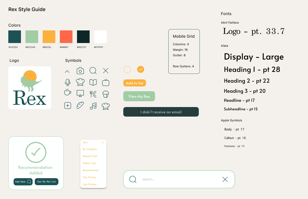
After establishing a general layout for the different features of the tool, I began to think about the look and feel of the interface. I created a moodboard to gain inspiration for a logo and color palette. I developed a style guide that contained colors with a playful, light, and joyful tone to encourage users to gravitate toward using the app. I used symbols and buttons with rounded edges to further emphasize the approachability of the app. I also used a light interface with lots of negative space to promote simplicity.


Step 3: Design
I began fleshing out my sketches with mid-fidelity prototypes in Figma. Then, I created high-fidelity prototypes to do usability testing with users. I gathered the feedback from testing to modify the design. After that, I did another round of usability testing to further test if my changes improved the design for users and to see how I could further address other pain points.
Mid-Fidelity Prototypes
Using the ideas from my strategizing, I translated my wireframe sketches into mid-fidelity prototypes in Figma. Mid-fidelity prototyping helped me to see what my ideas would look like digitally as well as how the app would interact and function.


Option 1Option 2
High-Fidelity Prototypes
Ideally, I would have conducted usability testing with the mid-fidelity prototypes, but due to the limited availability of users’ time to test, I opted to test with high-fidelity prototypes so that I could get more complete feedback that included input on the look, feel, and functionality of the app.
Usability Testing - Round 1
Goal: Identify pain points in the user experience.I created a usability testing guide with a flexible script for my first round of usability testing. I established my standards for success: completion rate, duration metrics, error rate, System Usability Scale (SUS), and user quotes. I planned 5 tasks that addressed the primary aspects of the app:
Set up an account
Add a recommendation
Check off a recommendation
Reorganize recommendations
Modify a reminder
I also developed a set of questions to discuss with users after completing the tasks to further probe and learn about their experience with the prototype. I tested with 4 users from the initial survey, using a mix of people who had and had not participated in the user interviews.

I learned about the importance of clearly understanding success metrics.
Completion rate - unhelpful because everyone eventually completed all of the tasks and everyone attempted them
Duration metrics - unhelpful because there wasn’t a control variable to compare the data against
Error rate - unable to calculate because I didn’t collect data on the number of attempts made
System Usability Scale - was positive at 71%, but it didn’t provide insight into how to improve the design
I found the user quotes and observing the errors made when completing the tasks to be the most helpful from this round of usability testing. I created an affinity map so I could see trends and identify pain points of the design.
Usability Testing Insights -
Round 1
Difficult to remember to swipe between screens to access the recommendation list
Category section takes up too much space on the screen
Liked the idea of reminders but wanted to know what it would actually look like


I used these insights to modify my designs.


I decided to add an arrow on each page, in addition to the ability to swipe, so that users would have a clear visual cue for how to navigate between screens.


I returned to my wireframes to build out an alternative design idea I had developed early on in the process. This still allows users to see the different categories but allows for more screen use for whatever users want to focus on in the moment.
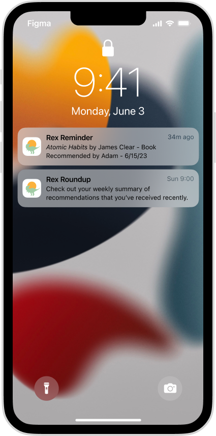
I designed two types of reminders. One is the type that can be set by a user who wants to set a day, time, or location to remember to check out a recommendation. The other type of reminder is app-generated and provides a roundup of recent recommendations to check out.
Usability Testing - Round 2
After modifying my designs based on feedback from the first round of usability testing, I tested my prototypes again. I used the same set of tasks and post-task questions to gain feedback from users. I used user quotes, my observation of errors, the System Usability Scale to measure success, and a comparison of completion times for tasks and user recommendation ratings.
Goals:
Determine if the changes I made improved the user experience
Identify any other pain points to further improve the design

Usability Testing Insights -
Round 2
The feedback was overall positive, and the SUS score was 74% (an increase from 71%). The main takeaways for improving the design were:
Navigation needs to be more clear and with more access points
The arrow button improved navigation overall
But several users searched for the recommendation list by clicking on the hamburger
Improvements needed with symbols used
The “plus” symbol confusing because all three buttons are ways to add a recommendation
Confusing to have the arrow amongst the recommendation adding tools
Make certain actions more aligned with users natural instinct
Every user tried to click in the middle of the recommendation to expand it instead of the “information” button (the “i” inside the circle)

Step 4: Refinement
Using the feedback and insights from the final round of usability testing, I refined my prototype to this final version. This is an overview of the app and its features, as well as what it would look like on a tablet and desktop.

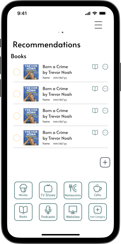
The app holds all of the important details about a recommendation for the user.
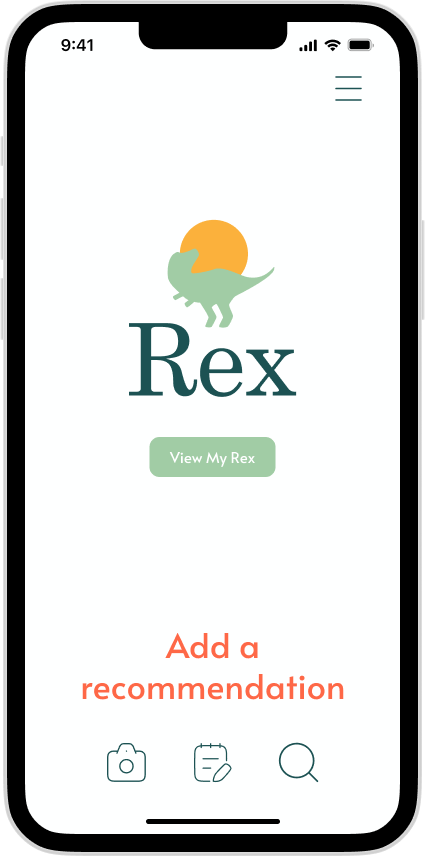
Rex includes multiple tools for adding a recommendation.
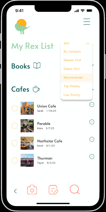
Users can navigate between adding a recommendation and their Rex List in four different ways.

When a user uses the search function to add a recommendation, the app will auto-fill details about the recommendation using the power of a search engine.

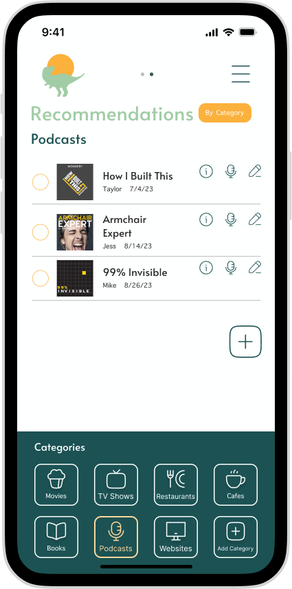
The app has a built-in organizational structure, so users don’t have to organize it themselves.
Users can sort the way they see their Rex List based on their personal preferences.
The app will remind users of recommendations and allows users to set their own reminders for when it’s most convenient.
Step 5: Conclude & Reflect
To conclude, I assessed the impact of my work based on user feedback and success metrics that I measured. I reflected on what I learned through this case study, and I determined what my next steps would be with this project.
Impact
The changes in my designs were supported by the success metrics I measured between the first and second usability tests. Users’ feedback was overall positive in the way that they described the app.
Reduced time taken to add a recommendation - 28 seconds —> 24 seconds
Reduced time taken to check off a recommendation - 24 seconds —> 14 seconds
Increased System Usability Scale rating - 71% —> 74%
Increased user rating for likelihood of recommending the product - 4.2 —> 4.7 out of 5
“I feel like I can make it my own and it doesn’t have to be used one way.”
“If you ever actually make it, I’ll use it.”
“It makes sense how you use it.”
“I like that you have the categories, and you can have all the recommendations in one place.”
Reflection
I learned so much from doing this project. I learned how to take an idea, turn it into something tangible, and respond to user feedback to improve my idea and designs. These are my biggest takeaways from the project:
It’s important to be informed about the success metrics, including how to analyze them, so that I am better able to collect useful quantitative data to measure success.
Adding more specificity in my goals for my usability testing will ensure that I’m testing for and targeting the improvement of specific aspects of my design. This will also help me to have a better sense of when to conclude a project.
Documentation along the way will make the process of telling the story of a case study smoother rather than having to retroactively collect the different pieces.
Next Steps
A design is never truly finished, so I would do another round of usability testing to see if the changes in the design of the navigation improve task completion rates
Develop a dark mode version of the app so that users can better customize the experience of the app
Create a pathway for adding recommendations that users find from websites and in-app suggestions