Spotify
Making Its Features More Accessible

*a conceptual redesignOverview
Spotify is a music streaming app used by millions worldwide. I’ve been a user for years, and it has shaped the way I listen to music. It pioneered music streaming and is continually adding new features to its platform. However, the platform has evolved into a sometimes overwhelming interface. I chose to focus on redesigning the homepage with these goals in mind:
Make the features of Spotify more accessible
Simplify the experience without sacrificing the diversity of options
Create an inviting experience
Problem: Users need an easier way to navigate and customize the Spotify app and its many features because they find the experience overwhelming.Using research, ideation, usability testing, and refinement, I developed a solution that creates a smoother experience when using the app and is flexible for users with different listening styles.
Role: Sole UX Designer
Duration: 1.5 months (Nov-Dec 2023)
Tools: Figma, FigJam
Design Process
1 - Research
2 - Strategy
3 - Design
4 - Refine
5 - Conclude
Step 1: Research
I’ve been a Spotify user for years, but as time has passed I’ve noticed that it has become more cluttered. I wanted to see if others felt that way, and learn of other pain points that users experience, so I conducted user interviews. To complement the user feedback, I also researched Spotify’s competitors to identify their layouts, advantages, and challenges.
Goals:
Understand Spotify users’ listening and discovery experiences using the app.
Discover if there are common specific pain points with the app that could be improved.
User Interviews
I asked people what music streaming platform they used and found 5 people who use Spotify to interview. I asked general questions about how Spotify fits into their lives. I also specifically asked questions about the way Spotify is organized on both mobile and desktop, and I asked about their habits with music discovery and their use of podcasts.


User Interview Insights
I took the user feedback and created an affinity map to see the common ideas and trends.
Everyone uses Spotify differently and is a part of users’ daily/weekly routines
Users describe the layout of the homepage as messy, overwhelming, and mentally exhausting which leads them to avoid music discovery on Spotify’s platform
Users are a fan of the pre-generated features like song radio and Daily Mixes
Competitive Analysis
I looked at some of the most popular streaming services according to Statista and most similar streaming services to Spotify according to Free Your Music. These were my goals when doing this analysis:
Understand what makes Spotify stand out
Determine the strengths and weaknesses of Spotify’s competitors
Understand the organization and features of Spotify’s competitors

Competitive Analysis Insights
The Homepage is generally used for music curated to the user
Most platforms have music, podcasts, etc. separated, rather than automatically mixed together like Spotify
Using a square layout with visuals from album covers is the standard
The primary disadvantage of Spotify is the lack of ability to listen with a higher sound quality
Features exclusive to a particular platform tend to be the advantage of another platform over Spotify
Step 2: Strategy
Using the insights I gained from user interviews, I developed 3 user personas to represent the different types of Spotify listening styles and an empathy map to highlight the overarching feelings, emotions, and attitudes about Spotify.
Personas
All users want a simple and organized experience to achieve their listening goals. Users tend to be young adults in their 20s-30s. I used user personas to narrow in on the different types of Spotify users.

Persona 1 - JackAlways listening to something
Wants to find sounds to fit the moment
Open to discovering new things

Persona 2 - MonicaAlways looking for new music
All about music
Prefers to listen to music that she’s curated herself
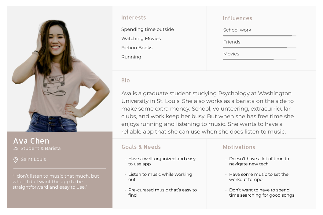
Persona 3 - AvaOccasional, situation-specific listener
Enjoys the curated features
Doesn’t want to spend time learning new tech
Empathy Map
I created an empathy map to show the common sentiments that I gathered from my user research about Spotify.

How Might We Questions
I reviewed the insights from my research as well as my user personas, empathy map, and problem statement to develop How Might We… (HMW) questions to inspire and guide my ideation. I decided to focus on improving the homepage of the mobile and desktop versions because it caused the most pain points for users.
Problem statement: Users need an easier way to navigate and customize the Spotify app and its many features because they find the experience overwhelming.I also considered some of the goals that Spotify might have and would perhaps want me to consider when designing:
Innovation is key and we want to showcase different ways of listening to users
We want users to spend as much time as possible listening
How might we…
clearly organize the features of Spotify so that users can easily find what they’re looking for?
enable users to feel that they have more control over their listening experience?
create an intuitive listening experience so that users actively chose Spotify as their streaming platform?
improve the experience of discovering new music on Spotify?
Ideation
My ideation evolved from thinking in words, to being inspired by the possibilities for change when looking at screenshots of Spotify in its current iteration, to further developing my ideas through sketching.
I began my ideation with jotting down ideas for each HMW question. However, I found it more difficult to visualize these changes without imagery.

So, I took screenshots of the Spotify app to more closely examine how I could change and improve it. I asked myself what the purpose of a homepage in a streaming app is to try to distill and highlight the essential features to reduce the feeling of overwhelm in the app.

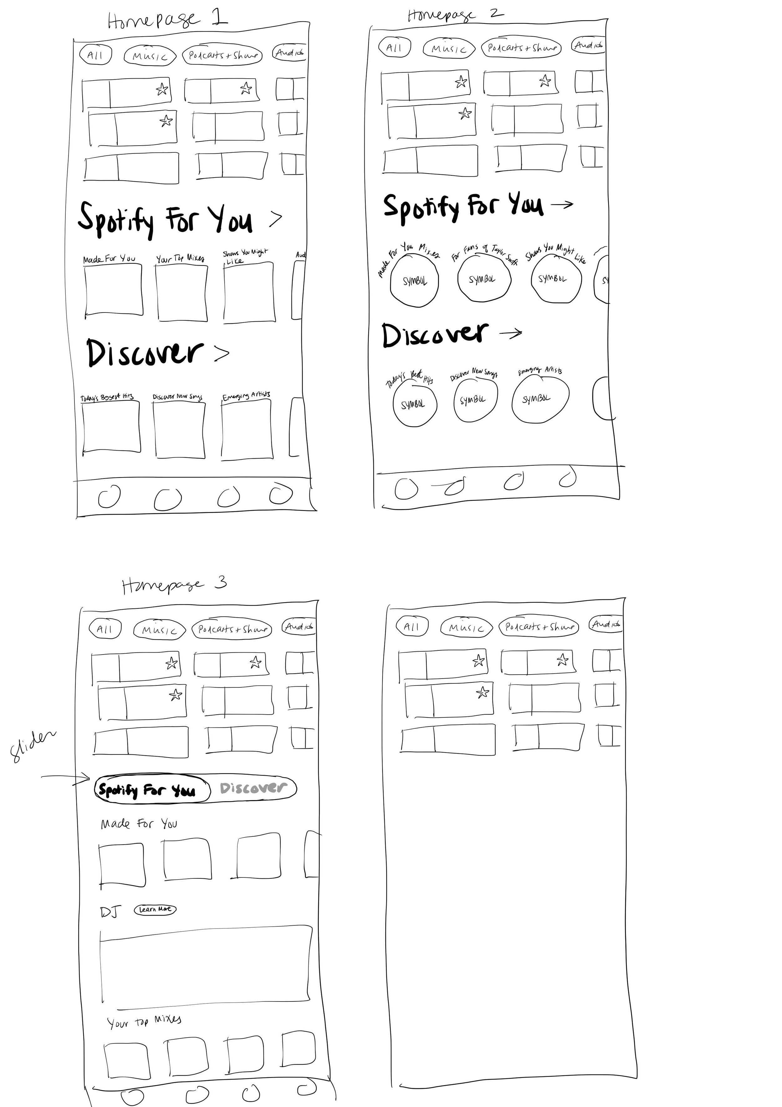
As I scrolled deeper down the homepage and gained more understanding of its current state, I started to sketch a first possible redesign. I wanted to maintain a similar feel while creating more simplicity with the experience.

Then, I realized that hidden within the “your profile” section, Spotify has a “What’s New” section that shows new activity from artists you follow. I also decided to pull this feature into the bottom navigation bar to help improve music discovery and make this feature more accessible.


Sketches
As my ideas developed, I decided to create two main sections on the homepage:
Spotify For You - music curated to your tastes based on what you already like
Discover - music that is different from what you typically listen to

Style Guide
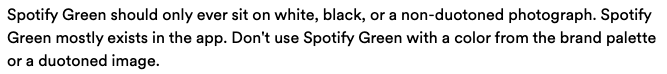
When starting to think about translating my sketches into digital designs in Figma, I referred to Spotify’s Design Guidelines. I wanted to largely maintain the same aesthetic that Spotify already has because users didn’t find any problems with it and because I didn’t want to disrupt users’ familiarity with and understanding of how the platform works anymore than necessary.
Spotify’s Design Guidelines


My Style Guide
Step 3: Design
I created mid-fidelity prototypes to in order to test my designs with users. Then, based on user feedback, I improved the designs and completed a second round of usability testing.
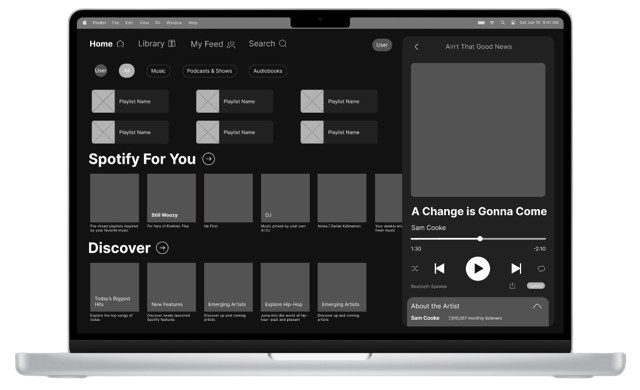
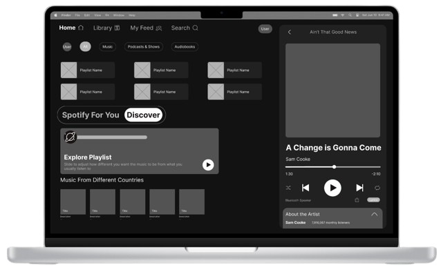
Mid-Fidelity Prototypes
I designed mid-fidelity prototypes, so that I could show users what my design ideas would look like digitally without going into too much detail so that I could easily make changes based on their feedback.
Homepage 1 & Homepage 2


My Feed & Discover


Usability Testing Round 1
Before conducting the first round of usability testing, I came up with a plan. I identified the most important user tasks and determined my goals for this round of testing. I also designed 6 task scenarios so that I could watch users interact with the prototype and established success metrics.
Goals:
Determine which layout for the homepage users prefer for both mobile and desktop
Find opportunities to improve the design so that navigation is clear
Determine the best way to deliver the information about new features to improve engagement with new features
Determine how to improve a feature that gives users more autonomy
Find opportunities to provide more autonomy for users
Approach
In order to make the best design decision for the homepage, I designed two options and performed A/B testing on users to determine which design to use. I conducted usability testing with 5 users, a mix of some who were part of the user interviews and some other different Spotify users. In order to conduct A/B testing, I alternated between users completing the tasks with the first and second versions of the homepage.
I wanted further insight into the differences between the two home screens. So after users completed the task scenarios, I had them explore the version of the homepage that they hadn’t explored during the official task and asked them questions to understand which they preferred and why. This additional user insight was helpful because the overall task success rate for both homepage versions was nearly identical.


Usability Test Insights - Round 1
I analyzed the data that I collected from this round of usability testing to identify the key insights.
It’s not that users feel a lack of autonomy but more a lack of opportunity to find things further outside of what they typically listen to and really liked the Explore Playlist feature because of that opportunity
Visually preferred Home 2, but functionally preferred Home 1–seemed more intuitive
Prefer an option for easier navigation between different categories, something more explicit than the filters that Spotify currently uses
Overall easy to navigate
Really liked My Feed because it gives users a space to check out new things when they’re in the space/mindset to do so
High-Fidelity Prototype 1
Based on the insights I gathered from my first round of usability testing, I made changes to the design. I sketched to brainstorm different ideas, and then I developed a high-fidelity prototype to give users a more realistic experience when using the prototype in my next and final round of usability testing. I focused on developing the mobile version only due to time constraints and because I planned for the desktop version to be quite similar to the mobile version.


Key changes
Moved forward with Homepage 1 since it had the most success overall with user comments and task success rate
Swapped Spotify’s filter categories for collapsible and expandable category sections for Music, Podcasts, and Audiobooks
Used the same collapsible categories for the My Feed page
Usability Testing - Round 2
I focused on testing with the mobile version of the app because I wanted the desktop version to be quite similar to the mobile version for ease of use. I tested with 4 users and used a similar set of task scenarios and success metrics as the first round of usability testing. With my final round of usability testing, I had 3 goals:
Determine if there are other ways to create opportunities for listening discovery.
Determine if the organization of the prototype makes sense to the user.
Determine if the navigation is simple and straightforward.
Usability Test Insights - Round 2
I collected insights by compiling user comments and finding common trends within them as well as comparing the task success rates and System Usability Scale (SUS) scores between the first and second usability tests.
Overall, users found the prototype easy and straightforward to use.
Users like that you can see everything from the beginning on the homepage and like the ability to minimize what you don’t want to see.
It would be helpful to add more visual elements to make navigation more clear and so that the app isn’t reliant on reading headings.
The labeling for “My Feed” was confusing and unintuitive because it was difficult for users to find newly released music.*
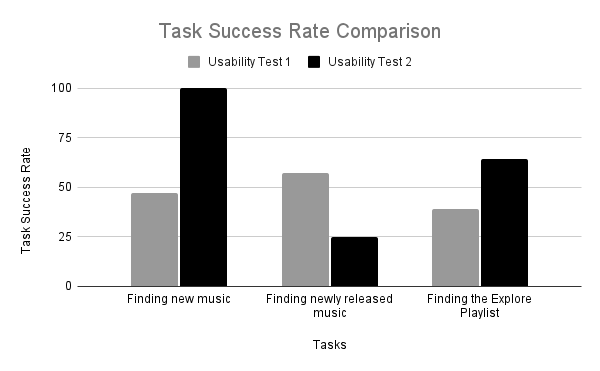
*I reflected on the lower success rate of the second task in the chart and the decreased System Usability Scale score from 76% to 72% despite not changing the “My Feed” label between the two usability tests. I think because I had fewer tasks in the second round of usability testing where users used the bottom navigation bar, they focused on trying to complete this task only within the main window.
When I showed them the path for successfully completing the task, most users commented that they hadn’t even considered looking at the bottom navigation. However, when thinking about design improvements, I wanted to find a way to make the labeling more clear.
Step 4: Refine
In designing my final prototype, I focused on decreasing friction for users when navigating as well as improving the wording and symbols used based on user feedback.

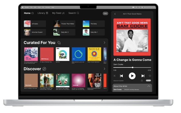
I used “Curated For You” rather than “Spotify For You” to more clearly communicate the intention of the section. I also used “Following” instead of “My Feed” so that users can easily understand what they’ll find on that page. To further increase clarity for users, I added symbols to match the headings, so that users can get know more about a page or section from a glance.


I grouped similar listening content so that users quickly know where to find what they’re looking for while also including the ability for users to quickly minimize and maximize the different types of listening content to fit their preferences.


I increased the accessibility of features by giving a separate page for users to easily follow the most recent releases from their favorite artists, podcasters, and authors.


Step 5: Conclude
After making improvements to the high-fidelity prototype, guided by user feedback, I concluded the project. I examined the impact of this conceptual redesign, reflected on what I learned, and determined the next steps for this project.
Impact
Easier access to the features of Spotify through customization and subtle shifts in the layout
A simple and inviting homepage that shows users the array of listening options while making it clear where to go for their listening purpose
Greater consistency between the mobile and desktop versions in order to retain simplicity and ease of use
“Very minimalistic–I like it.”
User Quotes“It’s a bit more organized in the prototype because things are where you expect them to be.”
“I like that I can minimize podcasts and audiobooks because in the actual version of Spotify there are so many signals and noises now.”
“I like that on the homepage you can see everything from the beginning, and there’s nothing complicated about it.”
“I like the prototype because it’s easy and not as confusing.”
Reflect
In the future, I would set a predetermined amount of time to allow users to struggle through a task before ending the task and giving them the answer. It would help to ease users’ discomfort of being unable to complete a task, and it would give me more reliable data about task completion and duration.
I learned to work within the parameters of a company, especially in terms of their design guidelines. I may have explored more with color or fonts, but I needed to find ways to make changes within the constraints of the company’s guidelines.
I would have done more testing involving the desktop version as well so that I could confirm that the mobile design translates successfully to the desktop version.
Next Steps
Determine if the new changes are effective:
I would conduct another round of usability testing to determine if the added symbols and change in wording increased the speed of navigation.
Develop the “Following” tab:
I would further develop the “Following” tab to show what it looks like when following authors, podcasts, and friends, in addition to musicians. Users really enjoyed that this was an easily accessible feature, so it would be nice to more fully flesh out.
Improve the “Search” Function:
I would explore how to improve the “Search” section of Spotify. There’s some overlap between the “Discovery” section that I developed and the “Search” section in the actual version of Spotify. I would be interested in understanding how users conceptualize the difference between the tools and how to make the “Search” area more simple and straightforward.