Vouch
An App that Reimagines the Job Listing
Overview
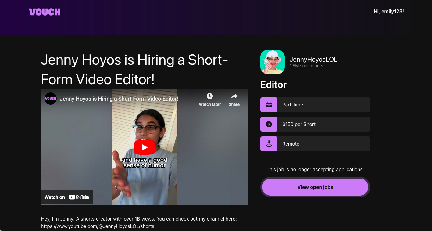
Vouch is a tech startup with the mission of helping digital creators build their teams. The platform connects popular content creators with their skilled fans and other workers who are skilled in a variety of professions and are eager to work primarily in the YouTube content creation space. As the Vouch team has developed this pioneering platform, they were looking to improve their job listing page.
Problem: In current job listings information is ineffectively shared because of the way content is presented, which deters users from engaging.
I was tasked with the job of designing a fun and engaging job listing page that would entice Gen Z users who want to work for digital content creators and increase content creator buy-in for utilizing and spreading word about the Vouch platform by increasing the applicant submission rate.
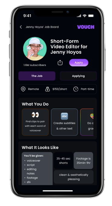
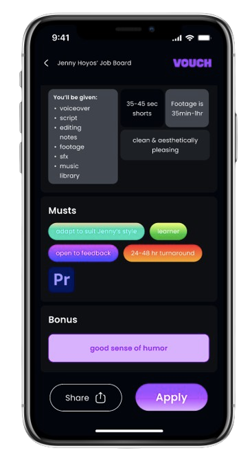
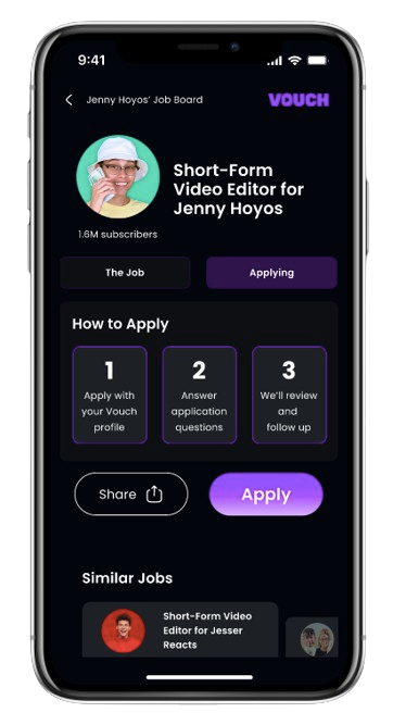
I created a mobile-first job listing page that can easily be translated to desktop. My design uses dynamic layouts that engage and interest the user while remaining consistent with the brand identity.
Role: UX Designer & Collaborator
Duration: 3 weeks (November-December 2023)
Tools: Figma, Google Meet
Design Process
1 - Strategize & Plan
2 - Design
3 - Refine
4 - Conclude & Next Steps
1 - Research & Strategize
First, I did some research to understand the problem space, the user, and figure out how to use the UX process to solve the problem. Then, I met with the CEO of Vouch to establish the scope and timeline of the project. After the meeting, I did further research and developed a strategy for improving the job listing. I presented my findings to the Vouch CEO and designer to hear their feedback.
Initial Discovery
I was invited to help solve the problem of designing a better job listing, so I needed to gain some background understanding of the company, figure out how I can best apply my process to this problem, and determine what I more I need to know before moving forward. I explored the existing Vouch website and job listings. I also laid out my questions and an outline for a conversation with the Vouch founder and CEO for talking about next steps.
Existing Vouch websiteMeeting OutlineEstablish Scope & Timeline
I met with the founder and CEO of Vouch to establish the scope of my role for the project and the steps moving forward. We also discussed the current context and longer term goals of the company and some of the preliminary design thoughts around the job listing page.
Scope:
Mobile design is the priority, but desktop design is still important
Creating designs that match the current branding of Vouch
Reducing amount of words used is ideal
Creating a listing that can accommodate varying amounts of input from content creators
Designing for people who want to work in the creator economy and are often fans of the creator
Assessing design success comes from publishing the designs on the site and gauging engagement
Landscape Analysis
First, I set out to learn more about the landscape of the users I was designing for. I learned about what kind of designs appeal to Gen Z. I explored different sites to see the formats they use for their job listings. I looked at content creators’ job listings. Then, I reflected on the purpose of a job listing. From there, I researched the typical elements of a job listing as well as specifically the job listings for content creator teams.
The major problems with job listings is the that they are text-heavy and not engaging. I researched design strategies for how to decrease zombie scrolling and improve scannability of a page. Another issue with long scrolling pages is that it can make it difficult for users to navigate the page, so I also researched how to create designs that will give users autonomy when navigating a page.
Design Goals & Possible SolutionsInitial Stakeholder Presentation
I met with the CEO of Vouch and their designer to communicate my research and strategy and to discuss how to move forward. In order to clearly communicate my ideas for the design of the job listing, I created some preliminary sketches. I explored the idea of separating the content into an “About the Role” and an “About You” page. I experimented with different overall layouts and layouts for the individual sections, and I explored different ideas for the header.
Meeting Takeaways
Next Step: Translate sketches into Figma
Continue ideating
Use pre-existing job listings to populate the prototypes
Keep the team in the loop (sharing half-baked ideas is okay)
Highlight the idea that applicants will be working with content creator celebrities
Make the listing fun and exciting
There’s a low barrier to entry–Vouch wants people to apply–so make it seem easy to apply
Can make the language less traditional and more informal
Experiment with a desktop design that takes a mobile first approach and concentrates the information to the middle of the page
Avoid illustrations, matte colors, and nostalgia and focus on gradients, bold and vibrant colors, and rounded geometric shapes
Promote sharing of job listings
Explore whether this job listing format will feel like the same experience even if there’s less content in the description since creators provide varying amounts of info
2 - Design
Using the feedback from my meeting with Vouch, I further developed my designs through sketching. Then, I created prototypes in Figma in collaboration with Vouch’s designer, which allowed more experimentation with color.
Ideation
First, I addressed the formality of the design by reimagining the standard contents of a job listing and then changing the language to convey a more informal and fun atmosphere. In order to imagine how this job listing might look across different content creators and different types of jobs, I filled the content using listings on Vouch’s site.
In order to imagine how this job listing might look across different content creators and different types of jobs, I filled the content using listings on Vouch’s site. I used different types of layouts for each section to help retain user engagement.
Writer/Producer Job Listing
Short-Form Video Editor Listing
Social Media Manager Job Listing
Prototyping
After that, I began creating the designs in Figma by creating a mid-fidelity prototype to establish the general outline of the design. Keeping the user in mind, I wanted to ensure that the designs remained easy to scan and fun to engage with. Soon after, we took a collaborative approach as the designs shifted to a more high-fidelity version.
Exploring Header LayoutsExploring with Color & Gradients3 - Refine
I made sure to regularly communicate the scope and needs to the project with Vouch, and I polished the design of the job listing based on feedback from the design team. I refined the colors by using gradients for the most important elements of the listing. I also used value variation and other simple colors to encourage visual engagement. I translated the mobile design to the desktop and utilized the extra space to showcase a video from the content creator.
Reevaluating Project Scope
The job listing page is foundational to the platform and must work in harmony with the rest of the application. The Vouch team determined that the job intake form, where content creators input information about the job they're hiring for, needs more development before further refining the job listing page so that the listing will mirror the job intake form. 4 - Conclude & Next Steps
I created a job listing page that will appeal to Gen-Z applicants and increase the number of applicant submissions. I identified my impact on the company, and I reflected on the experience. Finally, I describe the next steps that are being taken at Vouch.
An engaging and scannable job listing design for both mobile and desktop
Design collaboration with the team’s designer
A modifiable design that can be remixed to fit ever-changing needs
Impact
Reflect
With this project, I delivered dynamic mobile and desktop job listing designs. I was able to experience working for a less familiar user–Gen Z, which stretched my creativity and research skills. I had the opportunity to collaborate with another designer, which allowed me to practice communicating my design decisions as well as incorporating another designer’s perspective into my original design ideas. I also learned how to adapt my project goals and timeline as the needs of the company shift. Not everything goes to plan, and, as the project evolved, the Vouch team realized the efficiency of having a job intake form that mirrors the job listing. Before further refinement of the job listing and a launch of the design, there was a need to develop the job intake form, which I have the opportunity to help design moving forward.
Next Steps
Developing the job intake survey using creative questioning to elicit engaging job description content from creators.
Refining the job listing page to reflect the changes in the intake survey.
Publishing the job listing to determine how it affects the rate of applicant submissions.


